Portu

Services

Shopify Development

Branding


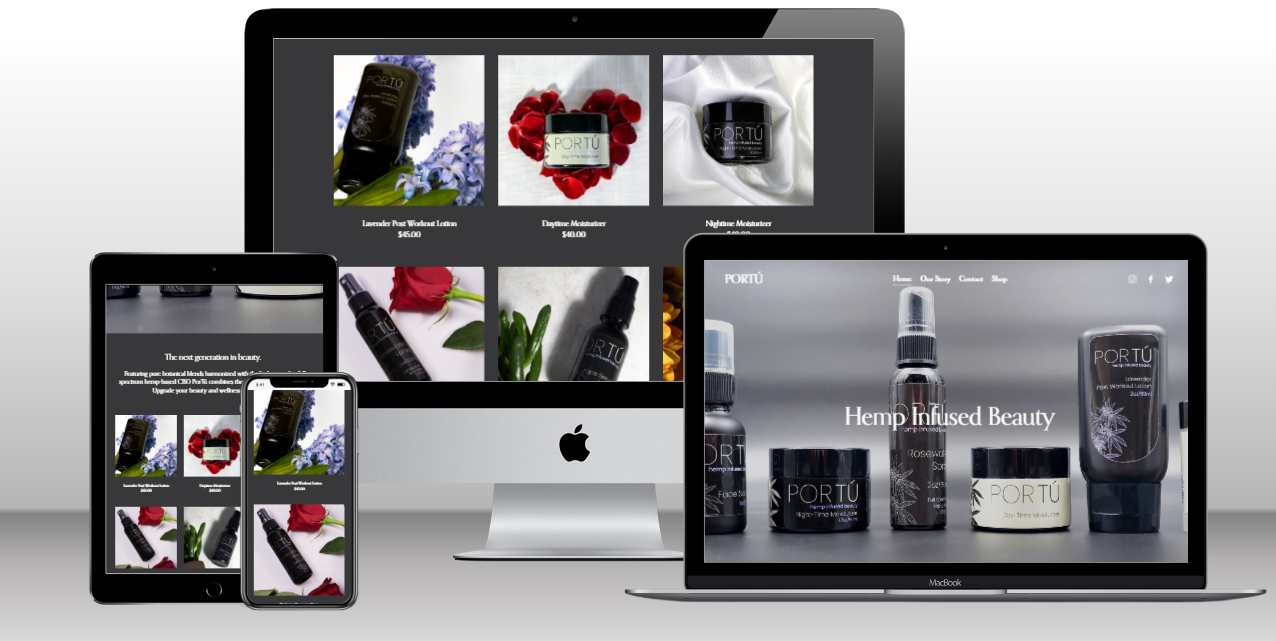
Portu, a producer of beauty and wellness products, sought a minimalistic and user-friendly website that reflected the simplicity and elegance of their brand. The focus was on creating an easy-to-navigate platform with a seamless checkout process.
project overview:

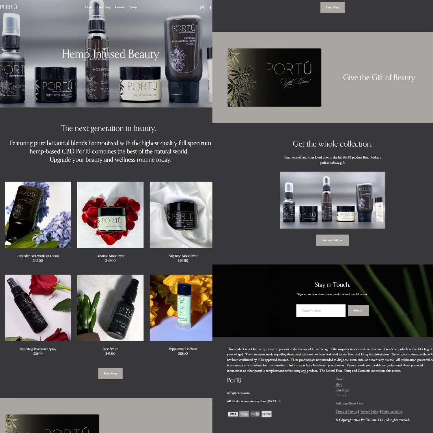
  • Minimalistic Design: Embracing the essence of minimalism, we designed a clean and elegant website for Portu. The design aimed to showcase their beauty and wellness products in a sophisticated and uncluttered manner.
  • User-Friendly Navigation: The website was structured for easy navigation, ensuring visitors could effortlessly explore Portu’s offerings and find relevant information.
  • Simple Checkout Process: A streamlined and user-friendly checkout process was implemented, minimizing steps and enhancing the overall shopping experience for customers.
  • Custom Coding: To achieve the desired minimalistic aesthetic and functionality, custom coding was employed to tailor the website to Portu’s specific requirements.

Results: The collaboration with Portu resulted in a website that embodies simplicity and elegance:

  • Minimalistic Elegance: The website’s design reflects Portu’s brand ethos, providing a visually pleasing and sophisticated online platform.
  • User-Friendly Experience: Visitors can easily navigate the site, explore products, and complete purchases with a hassle-free checkout process.
  • Enhanced Brand Image: The minimalistic approach contributes to an enhanced brand image, aligning with Portu’s focus on beauty and wellness.

Portu’s website now stands as a digital representation of their brand, offering a seamless and aesthetically pleasing experience for customers seeking beauty and wellness products.