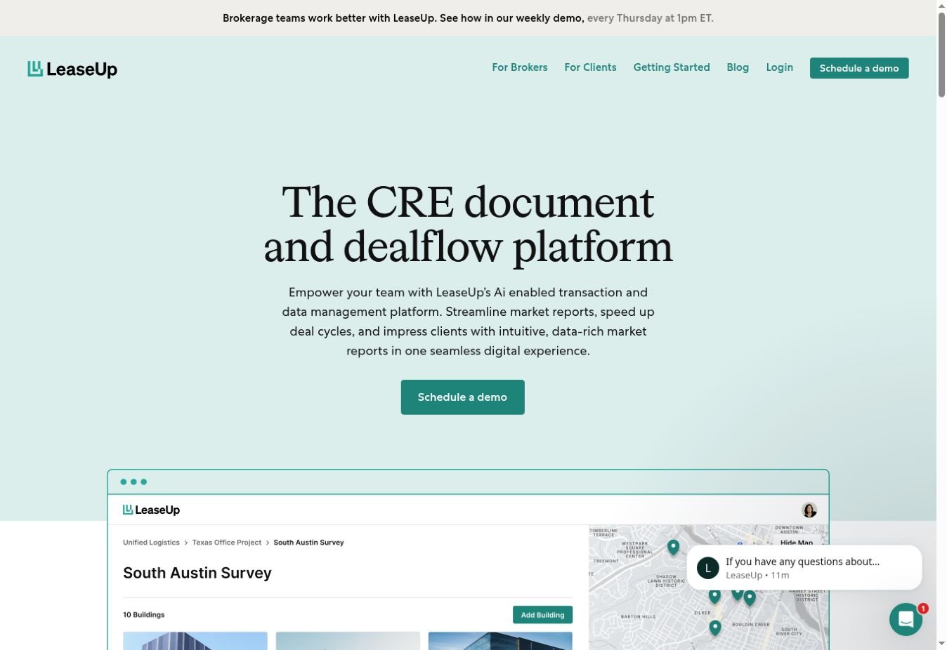
Software is easier to understand when you can see it at work. Calm colour, direct messaging and product views give this property platform a welcoming first impression.
ProjectLeaseUp
SectorProperty technology
PresentationSelected website
The website opening, captured for this project feature.
THE EXPERIENCE
Clarity for complex workflows.
A soft teal palette and expressive serif headline create an approachable opening. Product previews and separate routes for brokers and clients help visitors orient themselves.
01
Product in view
Interface imagery shows the platform in context rather than leaving the idea abstract.
02
An approachable palette
Soft teal and generous white space keep dense information from feeling heavy.
03
Audience-specific routes
Broker and client destinations make the navigation purposeful.
KEEP EXPLORING
Different businesses. The same care for the craft.
Explore more of our work, or tell us what you have in mind for your own business.